.jpg?width=1280&height=600&name=inclusive%20talent%20strategies%20(4).jpg)
As a result, the average salary offering in the public sector has also gone through a transformation.
You may be feeling the pinch as salaries aren’t matching the demands of the cost of living.
Our goal at Jobs Go Public is to ensure you have all the tools you need to make the best career decisions. That’s why we’ve created this handy guide on how to check your salary against similar roles.
This guide will show you how salaries have shifted across the public sector since the pandemic. This will allow you to understand whether the job you’re applying for is on par with the sector average.
What changes have we seen?
Job types with the largest salary increases
This is especially striking compared to Office for National Statistics (ONS) data. Over the end of the pandemic, the ONS tracked a 4.2% increase in gross salary across the whole public sector.
This suggests that these jobs saw at least double the rate of increase compared to most public sector roles. Our salary changes are also consistent with real-time national trends from Pay As You Earn data.

It’s also interesting to note that these salary climbs largely tie in with supply and demand on Jobs Go Public.
For example, demand for employees in Administration/Clerical at councils increased by almost double over the pandemic. The number of postings also nearly trebled for Support Staff, with 189% more roles posted in 2022 than 2019.
Job types the largest salary decreases
The following table shows the largest changes for roles whose average salary decreased during the pandemic.
Changes in this category were not as drastic as those seen for increases in the same period. The largest change was seen in Catering, where average salary decreased by a fifth.
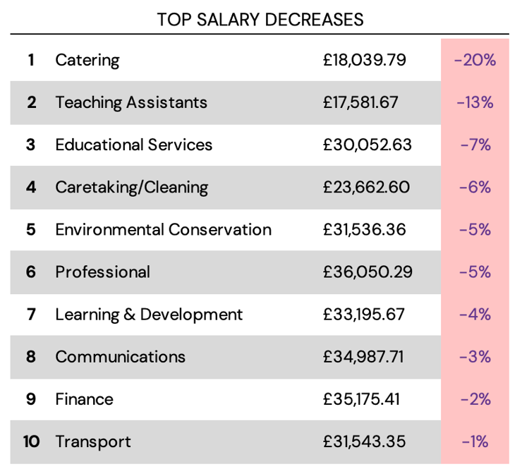
It is worth noting that only half of these job types saw a decrease in demand on jobsgopublic. In fact, demand for Catering employees increased by 6 times over the pandemic as the lockdowns stopped.
This may suggest that the average experience level councils require in these jobs has also dropped over the pandemic.
If you’re seeking a role in the above job types, it’s not all doom and gloom.
The average salary in the UK currently sits at £27,756. This shows that despite the above decreases, most public sector salaries still sit above the national average.
What’s more, around 80% of local government employers offer a market supplement with their salaries. Make sure to look out for these in vacancy listings when you are job hunting!
How do I check my salary?
Now that we’ve explored top level trends in salary changes, you may be wondering how to apply this knowledge. The trends above are based on benchmarks of salary data on Jobs Go Public.
If you know how to benchmark your salary, you’ll know what to expect to earn for your job title. Here are the steps you should follow to figure out what you should be earning:
1. Figure out what job title you want to be searching for. If it’s your current role, think of all the variations of that job title that an employer might use. Write these down and make a list.
2. Head to the job board. Type in your search query to find all the vacancies that are currently live with your desired job title.
You may also wish to use advanced search filters to narrow the results down. For example, you can select roles that are in your desired region or experience level.
3. Record all of the vacancies you see. You may wish to record details about each vacancy for future reference, such as:
-
The county
-
Employer name
-
Benefits on offer
The key information to capture is the lower and upper numbers in the job’s salary band.

4. Repeat this process for any variations of your job title as needed. You should aim to have as many roles in your list as possible to create an accurate data set.
5. Use a calculator or spreadsheet to find the average number for the upper and lower limits of salary (This is the total sum of the salaries for each role, divided by the number of jobs you have recorded information for).

6. You should now have an average figure for the upper and lower ends of your job title. This is your average salary benchmark!

Ready to take the next step in your career?
This information will help you to understand what the trends are in your desired job. Understanding the market will allow you to make the most informed decisions about which applications to invest your time in.
However, don’t forget to weigh this salary information against the employer’s overall value proposition! Smaller councils may not have the strongest salary, but often offer unique benefits. For example, a local discount scheme could have a more significant impact on your wellbeing.
If you're looking for an opportunity in the public sector, join our jobseeker network today!
*Methodology
The above study is based on a sample of 100,941 vacancies posted on Jobs Go Public over the pandemic. Within the league table we only analysed job types which had samples of at least 500 vacancies over 2019 and 2022.
Each job type was segregated by year of the pandemic and the midpoints of salary bands were averaged. We then calculated the percentage change between 2019 and 2022.
Save new job alerts
Save your searches as job alert emails and Be the first to hear about new opportunities that could be perfect for you.